A Look Back at Some Classic Case Designs for PS1 Games
Travel with us back to the '90s.
Published 3 years ago in Ftw

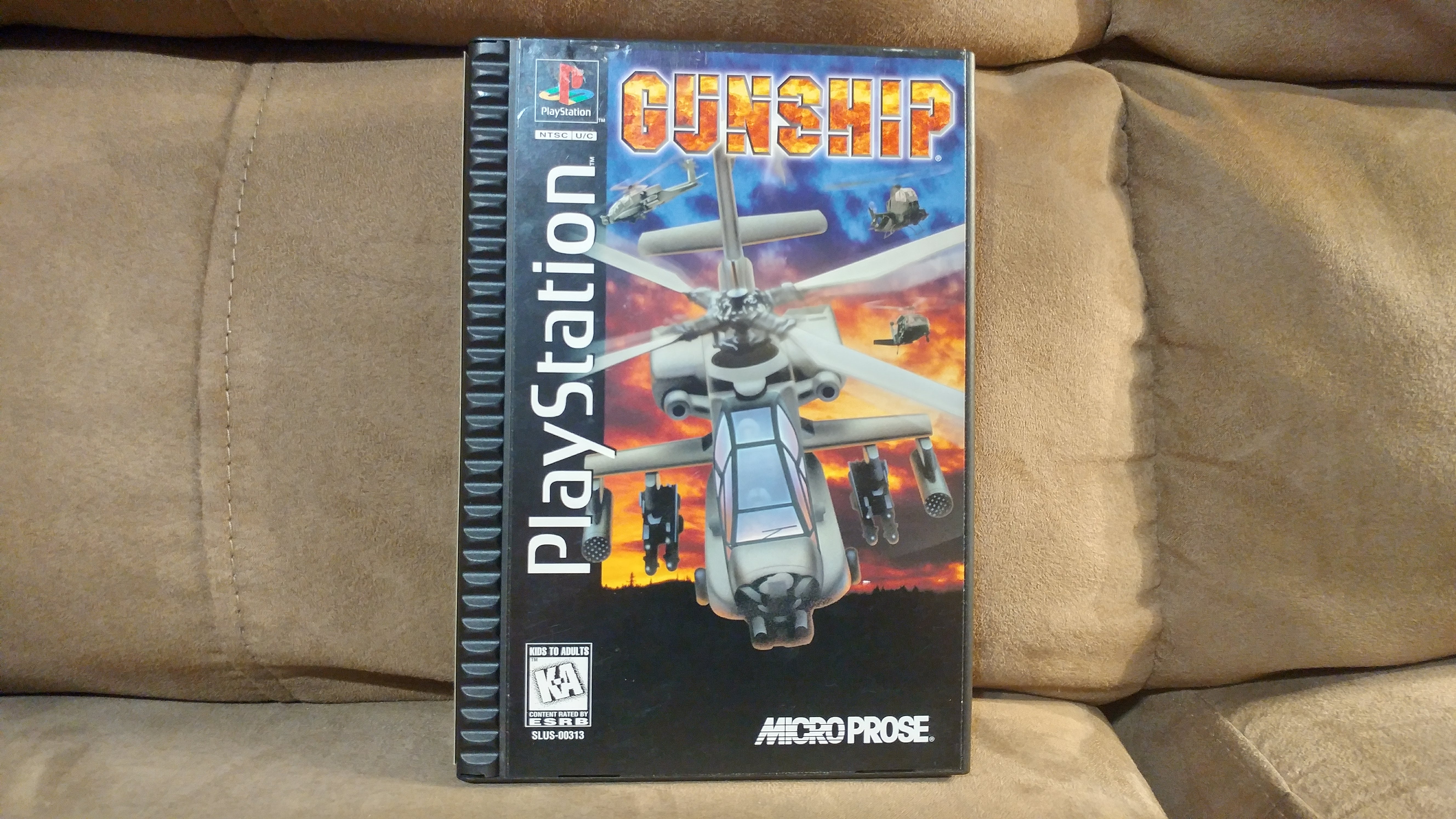
If you had the PlayStation 1 as a kid, you're undoubtedly familiar with "long boxes". This large style of game case that Sony used during the mid 90's is something seldom used today except in the case of some collector's edition games, and perhaps for good reason considering they required more than three times the amount of materials.
Also used by SEGA, these long boxes were originally designed to stand out on store shelves, and take advantage of the philosophy that "bigger is better".
Also Read: 15 Nostalgic Facts You Definitely Didn't Know About Gaming
Let's dive deeper.

This is the first generation of PlayStation 1 long case, used in 1994 and mid 1995. Notice the clear plastic shell and black spine.

Inside you would find a foam block over the CD to keep it from falling out of its tray. Also, the cover doubled as a game manual, with colored images. You might notice that there are some sharp edges, which was considered a hazard that needed to be addressed during development of a case design replacement.

This generation 1 case was the same as what SEGA used for its SEGA CD and SEGA Saturn games. They actually used the same manufacturer, which did help with volume and costs.

Shortly after, Sony found a new manufacturer to produce a generation 2 design in late 1995. This was a very unique style of case that had never been seen in the industry before.

Notice the ridges on the side. These were hard plastic and gave the cases a bold appearance that Sony was trying to deliver as part of its early PlayStation marketing.

Generation 2 cost Sony a bit more money since the manual was separate from the cover art, and games usually had additional art placed underneath the CD. While mere pennies of a difference, that added up when millions were manufactured.

While they looked cool, this style of box faced problems with durability due to how the paper art on the outside was glued to the plastic box. Over time it would come loose, and could even be pried off quite easily with the hands. Sony knew this wasn't the final design it was looking for.

Enter the generation 3 design released in 1996. Unlike the previous generation, there were no plastics used on the interior. Instead, the whole thing was made of folded cardboard.

The interior was largely the same as generation 2, but with the CD located at the top.

This clever design had some perks, but durability was still an issue, and manufacturing costs were high since no other companies were paying for supply of the design.

In late 1996 Sony would decide to move to music CD style of plastic case that was used for the rest of the generation. This cut costs, and also helped give the games a more modern look and feel, although they were smaller and less noticeable on shelves.

Ah, the good ol' days.

Also Read: A Look Back At The Insanity Of PlayStation 2's Launch Day
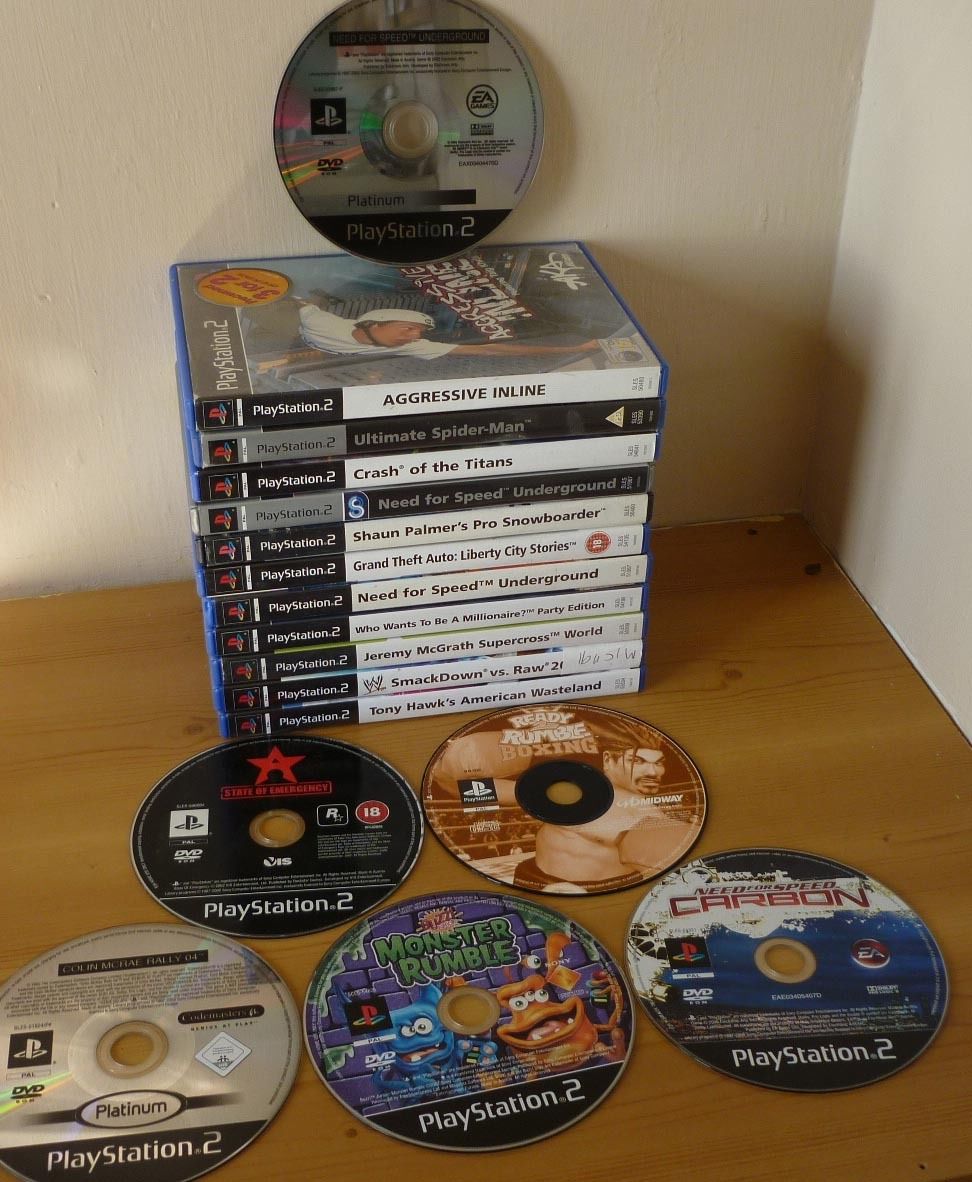
The industry would move to this mid-sized plastic box at the turn of the century. Surprisingly, this design has been used for more than 17 years now.


